


“Visuals come before taste” precisely captures the central role of packaging design in modern consumer culture. When consumers are faced with a wide range of ice cream options, the design of the cup itself often becomes the deciding factor in their purchase decision. Packaging is not merely a container; it is the brand’s first conversation with the consumer, carrying the responsibility of expressing brand personality, creating emotional connections, and establishing memorable touchpoints.

In customized ice cream cup design, patterns and textures extend far beyond decorative purposes. They establish visual hierarchy and directly influence consumers’ perceptions of product quality. Fine embossed textures convey a sense of premium craftsmanship, while bold geometric patterns tend to attract younger audiences seeking a contemporary aesthetic. Texture selection must also consider functionality: matte finishes enhance grip and reduce slippage, while selective spot UV coatings highlight key visuals and visually differentiate product lines.
A well-executed texture strategy enables packaging itself to become an integral part of the overall experience. When consumers hold the cup, synchronized visual and tactile feedback reinforces brand perception. This multi-sensory interaction helps products stand out in an increasingly competitive frozen dessert market.

In an era dominated by digital visuals, hand-drawn art has become a powerful tool for emotional resonance. Its intentional imperfections convey warmth, sincerity, and individuality. For an inherently joyful category like ice cream, hand-drawn design softens the coldness of industrial production and emphasizes creativity and craftsmanship. This visual approach can be broken down into two core elements: hand-lettered typography and hand-drawn illustrations.
Handwritten Typography: The Brand’s Voice
Handwritten typography serves as the brand’s direct voice. Unlike standardized fonts, each handwritten style carries its own rhythm and emotional tone—flowing scripts express freedom and energy, while structured lettering suggests reliability and tradition. In customized ice cream cups, handwritten typography is commonly applied to product names, key slogans, or ingredient highlights, allowing them to stand out within the information hierarchy.
This design choice creates a sense of visual intimacy, subtly signaling the presence of real creators behind the product and narrowing the psychological distance between brand and consumer. During implementation, readability and alignment with brand identity are essential, as excessive decoration can undermine effective communication.

Hand-Drawn Illustrations: Visual Storytelling
Hand-drawn illustrations translate brand narratives into visual scenes. They may depict ingredient origins, moments from the production process, or imaginative imagery that stimulates taste anticipation. Illustration style directly defines brand positioning: watercolor styles align with natural and organic concepts, while line-based illustrations convey a relaxed, playful, urban character.
Compared with photography, illustrations offer stronger atmospheric control and stylistic flexibility, allowing designers to filter out unnecessary realism and focus on emotional expression. In application, illustrations should integrate seamlessly with the cup’s structure, guiding the viewer’s eye as the cup is rotated in hand to create a dynamic viewing experience.
When typography and illustration work together, they form a cohesive visual narrative. Typography functions as narration, illustrations as imagery—together transforming packaging into a compact, immersive storytelling interface.
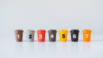
Color psychology plays a decisive role in ice cream packaging design. Bright yellow evokes happiness, soft pink suggests romance, and calm blue tones communicate freshness and trust. The “Ecstatic Colors” approach emphasizes high-saturation, high-contrast color combinations that capture attention instantly and trigger positive emotional responses.
Successful color strategies extend beyond aesthetics, incorporating cultural context and regional color associations. The same color may carry different meanings across markets, making localization essential for customized designs. Color selection should also align with flavor cues—such as strawberry reds or matcha greens—to establish intuitive taste expectations.

Integrating popular cultural IP into customized ice cream cups is an effective way to build immediate emotional connections. Collaborations with animation, film, or art IP activate existing emotional memories, transforming everyday purchases into cultural experiences.
Effective IP integration requires more than simply applying graphics. Design must balance brand identity with IP characteristics so that both enhance one another. Limited-edition IP collections stimulate immediate purchases while encouraging social media sharing, generating secondary exposure. For seasonal promotions or regional campaigns, IP collaborations create topical relevance and attract new consumer segments.
Packaging design represents the starting point of the customer experience journey. A thoughtfully designed ice cream cup enhances every touchpoint: clear ingredient labeling builds trust, easy-to-open lids reduce friction during consumption, and structural stability ensures proper product preservation. Even the potential for secondary use—such as repurposing the cup as a planter or stationery holder—extends brand interaction beyond the initial purchase.
Peak experiences often arise from unexpected details, such as playful messages on the inner wall, surprise graphics at the base of the cup, or temperature-sensitive designs that reveal hidden visuals. These low-cost “micro-moments” generate outsized social sharing value, turning ordinary consumers into brand advocates.
From a commercial perspective, a customized ice cream cup design is not superficial decoration but a strategic branding tool. It addresses three core challenges of standardized packaging: differentiation, emotional value delivery, and memorability.
A tiered design strategy maximizes return on investment while maintaining cost control. Core collections preserve consistent visual identity for brand recognition; seasonal editions introduce novelty to encourage repeat purchases; premium lines leverage special materials and finishes to elevate perceived brand value. Data-driven design iteration—testing visual impact against actual sales performance—enables continuous refinement.

Transforming creative concepts into physical products requires balancing aesthetic ambition with production realities. Material selection must address food safety requirements, sustainability goals, and cost structures. Printing techniques should balance visual impact with durability, ensuring clarity under cold storage conditions. Cup dimensions must also align with standardized logistics and warehousing systems.
Most importantly, packaging design must remain true to the product itself. Even the most visually refined cup will amplify disappointment if the ice cream inside fails to meet expectations. Truly successful design aligns visual promise with sensory experience—ideally exceeding expectations and reinforcing the belief that “what’s inside deserves this packaging.”
In an increasingly visual-driven ice cream market, cups have evolved from simple containers into cultural carriers. Every design decision—from color and texture to typography and narrative—quietly communicates brand values, defines target audiences, and shapes consumption scenarios. Brands that understand how to create complete experiences through design are reshaping competitive dynamics.
Professional customization services enable brands like SNFOOD to systematically build this visual advantage, transforming packaging into a silent yet powerful sales partner. When design becomes embedded in brand DNA, each customized ice cream cup transcends function, becoming a miniature art object that delivers a striking “first bite” moment in a visually led era.


